pacman::p_load(scales, viridis, lubridate, ggthemes, gridExtra, readxl, knitr, data.table, CGPfunctions, ggHoriPlot, tidyverse)Hands-on Exercise 6:Visualising and Analysing Time-oriented Data
1 Getting Started
In this exercise, we will use the following our R packages: scales, viridis, lubridate, ggthemes, gridExtra, readxl, knitr, data.table and tidyverse.
The code chunk below uses p_load() of pacman package to check if these packages are installed in the computer and load them onto your working R environment.
The code chunk below imports eventlog.csv into R environment by using read_csv() function of readr package.
attacks <- read_csv("data/eventlog.csv")Next, we will use kable() to review the structure of the imported data frame
kable(head(attacks))| timestamp | source_country | tz |
|---|---|---|
| 2015-03-12 15:59:16 | CN | Asia/Shanghai |
| 2015-03-12 16:00:48 | FR | Europe/Paris |
| 2015-03-12 16:02:26 | CN | Asia/Shanghai |
| 2015-03-12 16:02:38 | US | America/Chicago |
| 2015-03-12 16:03:22 | CN | Asia/Shanghai |
| 2015-03-12 16:03:45 | CN | Asia/Shanghai |
There are three columns which are timestamp, source_country and tz.
timestamp field stores date-time values in POSIXct format.
source_country field stores the source of the attack. It is in ISO 3166-1 alpha-2 country code.
tz field stores time zone of the source IP address.
1. Deriving weekday and hour of day fields
We need to derive two new fields which are wkday and hour before we can plot the calendar heatmap.
make_hr_wkday <- function(ts, sc, tz) {
  real_times <- ymd_hms(ts,
                        tz = tz[1],
                        quiet = TRUE)
  dt <- data.table(source_country = sc,
                   wkday = weekdays(real_times),
                   hour = hour(real_times))
  return(dt)
}2. Deriving the attacks tibble data frame
wkday_levels <- c('Saturday', 'Friday',
                  'Thursday', 'Wednesday',
                  'Tuesday', 'Monday',
                  'Sunday')

attacks <- attacks %>%
  group_by(tz) %>%
  do(make_hr_wkday(.$timestamp,
                   .$source_country,
                   .$tz)) %>%
  ungroup() %>%
  mutate(wkday = factor(
    wkday, levels = wkday_levels),
    hour  = factor(
hour, levels = 0:23))kable(head(attacks))| tz | source_country | wkday | hour |
|---|---|---|---|
| Africa/Cairo | BG | Saturday | 20 |
| Africa/Cairo | TW | Sunday | 6 |
| Africa/Cairo | TW | Sunday | 8 |
| Africa/Cairo | CN | Sunday | 11 |
| Africa/Cairo | US | Sunday | 15 |
| Africa/Cairo | CA | Monday | 11 |
2 Calendar Heatmaps
grouped <- attacks %>%
  count(wkday, hour) %>%
  ungroup() %>%
  na.omit()

ggplot(grouped,
       aes(hour,
           wkday,
           fill = n)) +
geom_tile(color = "white",
          size = 0.1) +
theme_tufte(base_family = "Helvetica") +
coord_equal() +
scale_fill_gradient(name = "# of attacks",
                    low = "yellow",
                    high = "red") +
labs(x = NULL,
     y = NULL,
     title = "Attacks by weekday and time of day") +
theme(axis.ticks = element_blank(),
      plot.title = element_text(hjust = 0.5),
      legend.title = element_text(size = 8),
      legend.text = element_text(size = 6) )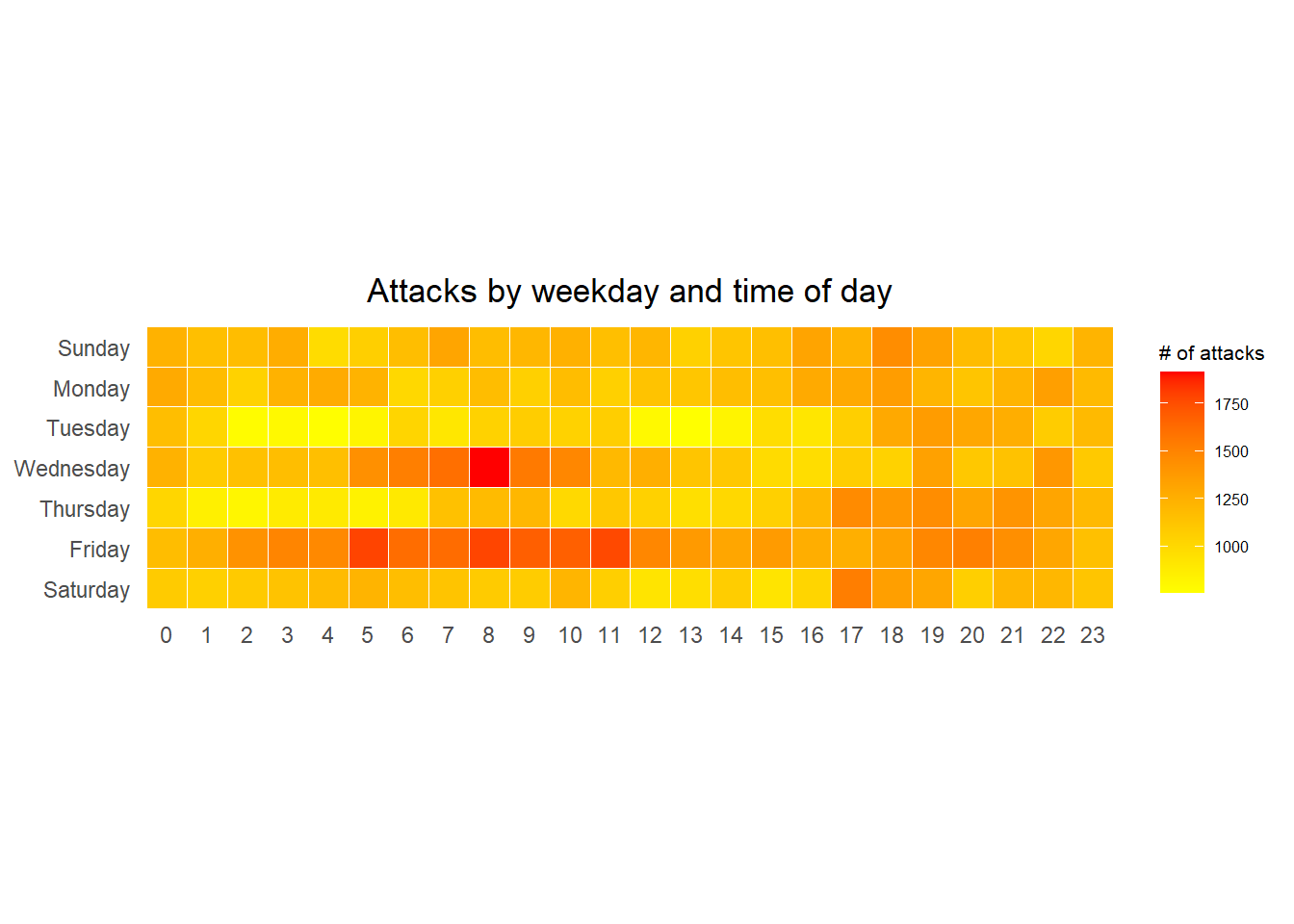
Things to learn from the code chunk
a tibble data table called grouped is derived by aggregating the attack by wkday and hour fields.
a new field called n is derived by using
group_by()andcount()functions.na.omit()is used to exclude missing value.geom_tile()is used to plot tiles (grids) at each x and y position.colorandsizearguments are used to specify the border color and line size of the tiles.theme_tufte()of ggthemes package is used to remove unnecessary chart junk. To learn which visual components of default ggplot2 have been excluded, you are encouraged to comment out this line to examine the default plot.coord_equal()is used to ensure the plot will have an aspect ratio of 1:1.scale_fill_gradient()function is used to creates a two colour gradient (low-high).
3 Multiple Calendar Heatmaps
3.1 Deriving attack by country object
In order to identify the top 4 countries with the highest number of attacks, we need to do the followings:
count the number of attacks by country,
calculate the percent of attackes by country, and
save the results in a tibble data frame.
attacks_by_country <- count(
  attacks, source_country) %>%
  mutate(percent = percent(n/sum(n))) %>%
  arrange(desc(n))
3.2 Preparing the tidy data frame
We have to extract the attack records of the top 4 countries from attacks data frame and save the data in a new tibble data frame (i.e. top4_attacks).
top4 <- attacks_by_country$source_country[1:4]
top4_attacks <- attacks %>%
  filter(source_country %in% top4) %>%
  count(source_country, wkday, hour) %>%
  ungroup() %>%
  mutate(source_country = factor(
    source_country, levels = top4)) %>%
  na.omit()
3.3 Plotting the Multiple Calender Heatmap by using ggplot2 package.
ggplot(top4_attacks,
       aes(hour,
           wkday,
           fill = n)) +
  geom_tile(color = "white",
          size = 0.1) +
  theme_tufte(base_family = "Helvetica") +
  coord_equal() +
  scale_fill_gradient(name = "# of attacks",
                    low = "yellow",
                    high = "red") +
  facet_wrap(~source_country, ncol = 2) +
  labs(x = NULL, y = NULL,
     title = "Attacks on top 4 countries by weekday and time of day") +
  theme(axis.ticks = element_blank(),
        axis.text.x = element_text(size = 7),
        plot.title = element_text(hjust = 0.5),
        legend.title = element_text(size = 8),
        legend.text = element_text(size = 6) )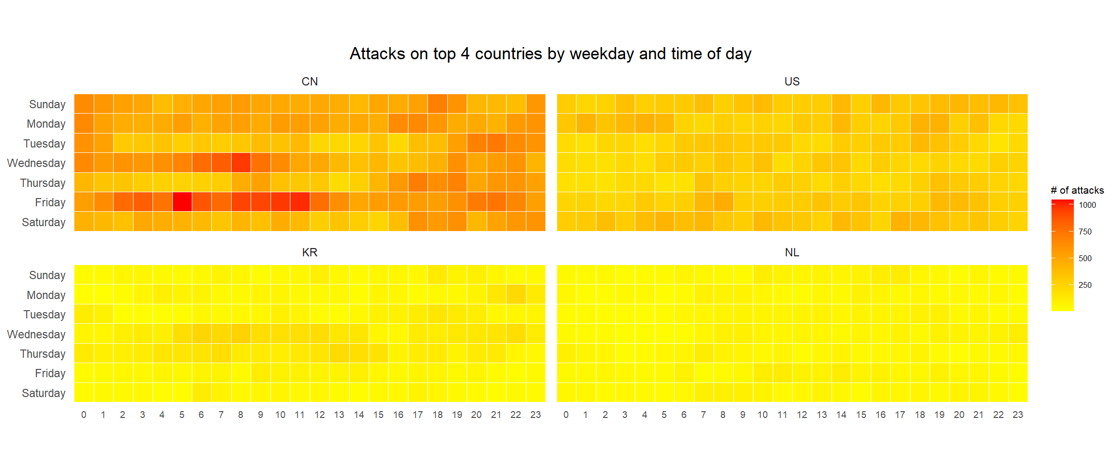
4 Cycle Plot
In this section, we will plot a cycle plot showing the time-series patterns and trend of visitor arrivals from Vietnam programmatically by using ggplot2 functions.
4.1 Data Import
The code chunk below imports arrivals_by_air.xlsx by using read_excel() of readxl package and save it as a tibble data frame called air.
air <- read_excel("data/arrivals_by_air.xlsx")4.2 Deriving month and year fields
In this step, we will derive two new fields called month and year are derived from Month-Year field.
air$month <- factor(month(air$`Month-Year`),
                    levels=1:12,
                    labels=month.abb,
                    ordered=TRUE)
air$year <- year(ymd(air$`Month-Year`))
4.3 Extracting the target country
Next, the code chunk below is use to extract data for the target country.
Vietnam <- air %>%
  select(`Vietnam`,
         month,
         year) %>%
  filter(year >= 2010)
4.4 Computing year average arrivals by month
The code chunk below uses group_by() and summarise() of dplyr to compute year average arrivals by month.
hline.data <- Vietnam %>%
  group_by(month) %>%
  summarise(avgvalue = mean(`Vietnam`))
4.5 Plotting the cycle plot
The code chunk below is used to plot the cycle plot.
ggplot() +
  geom_line(data=Vietnam,
            aes(x=year,
                y=`Vietnam`,
                group=month),
            colour="black") +
  geom_hline(aes(yintercept=avgvalue),
             data=hline.data,
             linetype=6,
             colour="red",
             size=0.5) +
  facet_grid(~month, scales = "free_y") +
  labs(axis.text.x = element_blank(),
       title = "Visitor arrivals from Vietnam by air, Jan 2010-Dec 2019") +
  xlab("") +
  ylab("No. of Visitors") +
  theme_minimal()
5 Slopegraph
In this section we will plot a slopegraph by using R.
5.1 Data Import
Import the rice data set into R environment by using the code chunk below.
rice <- read_csv("data/rice.csv")5.2 Plotting the slopegraph
Next, code chunk below will be used to plot a basic slopegraph as shown below
rice %>%
  mutate(Year = factor(Year)) %>%
  filter(Year %in% c(1961, 1980)) %>%
  newggslopegraph(Year, Yield, Country,
                Title = "Rice Yield of Top 11 Asian Counties",
                SubTitle = "1961-1980",
                Caption = NULL)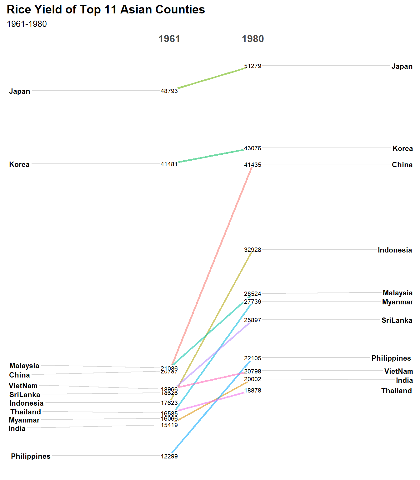
Things to learn from the code chunk
For effective data visualization design, factor() is used convert the value type of Year field from numeric to factor